Contents |
The tabbed dialog available with Tools : Statistics : Analysis (Shift+Alt+A) in SuperMemo provides graphs and tables that illustrate the current state of the learning process in the currently opened collection.
In addition to Analysis, SuperMemo provides multiple other analytical tools.
Distributions
Intervals
Intervals - distribution of inter-repetition intervals in a given collection. By changing the setting of the combo box at the bottom of the dialog, you can see interval distributions for all elements in the collection, for only items, and for only topics.
A-Factors
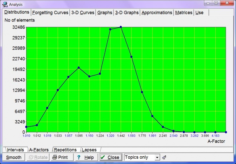
A-Factors - distribution of A-Factors in a given collection. The distribution itself is not used in Algorithm SM-15, and merely results from it. Note that topics and items use different A-Factor categories. Choose Items only or Topics only at the bottom to see distributions for items or topics respectively. If you choose All elements you will see a less meaningful conglomerate distribution indexed by A-Factor category number.
Difficulties
Difficulties - distribution of item difficulties as determined by Algorithm SM-17. See also: difficulties
Repetitions
Repetitions - distribution of the number of repetitions of items or topics in a given collection; only memorized elements are considered in the distribution, i.e. there is no zero-repetitions category.
Lapses
Lapses - distribution of the number of times particular items in the collection have been forgotten; only memorized elements are considered. You should never have more than 10% of items with more than 3-4 lapses. If this is not the case, you should re-examine the way in which you formulate items (see 20 Rules of Formulating Knowledge). As topics are never "forgotten" at repetition time, there are no lapses listed in Lapses if you select Topics only in the element type combo box.
Forgetting Curves
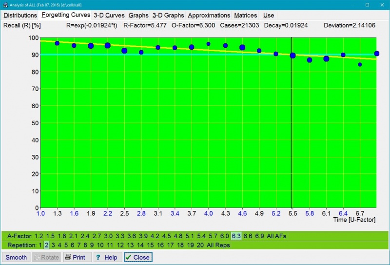
400 forgetting curves are independently plotted in order to compute the RF matrix in Algorithm SM-15. These correspond to 20 repetition number categories and 20 A-Factor categories. For data representation convenience, the columns of the RF matrix for the first repetition are indexed by the number of memory lapses rather than by the A-Factor. By choosing a proper combination of tabs at the bottom of the graph, you can select a forgetting curve of interest. Horizontal axis represents time expressed as: (1) U-Factor, i.e. the ratio of subsequent inter-repetition intervals, or (2) days (only for the first repetition). Vertical axis represents knowledge retention in percent.
Figure: The first forgetting curve (first repetition for items with no lapses). Unlike it was the case in earlier SuperMemos, where all forgetting curves were exponential, the first forgetting curve in SuperMemo 17 is approximated using power regression. This provides for a more accurate mapping due to the heterogeneity of the learning material introduced in the learning process that results in superposition of exponential forgetting with different decay constants. The use of power regression explains why the first interval might be slightly shorter in Algorithm SM-17. On a semi-log graph, the power regression curve is logarithmic (in yellow), and appearing almost straight. The curve shows that in the presented collection recall drops merely to 58% in four years, which can be explained by a high reuse of the memorized knowledge in real life. In earlier SuperMemos, recall data would only be collected in the span of 20 days, and negatively exponential forgetting curve would make for far lower retrievability predictions. The first optimum interval for the forgetting index of 10% is 3.76 days. The forgetting curve can be described with the formula R=0.987*power(interval,-0.07), where 0.987 is the recall on Day 1, while -0.07 is the decay constant. This is case, the formula yields 89.5% recall after 4 days, which is then used as the first rounded optimum interval. Almost 77,000 repetition cases were used to plot the presented graph. Steeper drop in recall will occur in collections with a higher mix of difficult items, in poorly formulated collections, or in new users with lesser mnemonic skills.
Figure: Tools : Statistics : Analysis : Forgetting Curves for 20 repetition number categories multiplied by 20 A-Factor categories. In the picture, blue circles represent data collected during repetitions. The larger the circle, the greater the number of repetitions recorded. The red curve corresponds with the best-fit forgetting curve obtained by exponential regression. For ill-structured material the forgetting curve is crooked, i.e. not exactly exponential. The horizontal aqua line corresponds with the requested forgetting index, while the vertical green line shows the moment in time in which the approximated forgetting curve intersects with the requested forgetting index line. This moment in time determines the value of the relevant R-Factor, and indirectly, the value of the optimum interval. For the first repetition, R-Factor corresponds with the first optimum interval. The values of O-Factor and R-Factor are displayed at the top of the graph. They are followed by the number of repetition cases used to plot the graph (i.e. 21,303). At the beginning of the learning process, there is no repetition history and no repetition data to compute R-Factors. It will take some time before your first forgetting curves are plotted. For that reason, the initial value of the RF matrix is taken from the model of a less-than-average student. The model of average student is not used because the convergence from poorer student parameters upwards is faster than the convergence in the opposite direction. The Deviation parameter displayed at the top tells you how well the negatively exponential curve fits the data. The lesser the deviation, the better the fit. The deviation is computed as a square root of the average of squared differences (as used in the method of least squares).
Figure: In SuperMemo 17, forgetting curves can be normalized over A-Factors (All AFs) at different repetition categories (All Reps)(as in the picture above). As a result, you can display:Time (normalized) stands at 100% for maximum U-Factor for each entry of the RF matrix. Decay stands for the decay constant of the forgetting curve. Cases shows the number of repetition cases used in plotting the graph. Repetitions stands for the number of repetitions executed when determining R-Factors. Deviation is a square root of the average of squared differences between the data and the approximated forgetting curve.
- your cumulative forgetting curve (blue dots)
- its negative exponential approximation used by SuperMemo (red line)
- individual data points from all forgetting curves collected by SuperMemo (yellow circles).
3-D Curves
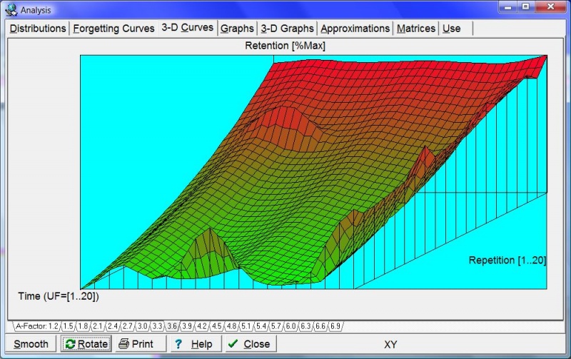
These graphs show the forgetting curves in 3 dimensions. There are 20 graphs available with A-Factor tabs at the bottom. Each graph corresponds to a different A-Factor (from 1.2 to 6.9). The X axis represents time (as in Forgetting curves). The Y axis represents repetition category (roughly corresponding to the repetition number). The vertical Z axis represents retention in percent (i.e. how much is remembered at a given moment in time). For better visibility, you can rotate 3-D forgetting curves with Rotate, or smooth them with Smooth. Rotate swings the graph on its Z axis by 90 degrees clockwise (as viewed from above). This means that X and Y axes get swapped. Note that smoothing proceeds along the Y axis. This makes it possible to align incompletely plotted forgetting curves from different repetition categories. However, once you click Rotate, Y axis smoothing will produce a different result (e.g. after the first Rotate, smoothing will reduce kinks along the repetition categories). For the best illustration of the forgetting process, smooth the graph before you rotate it.
Figure: Exemplary 3-D graph of forgetting curves for A-Factor=3.6. Axes: X - repetition category, Y - recall in percent (knowledge retention), Z (the incoming axis) - time (expressed by U-Factor). The graph has been smoothed along the Y-axis (by averaging results corresponding to different repetition categories), and rotated once for better visibility (the slope illustrates forgetting in time that is roughly similar for various repetition categories except those with high repetition number that may reflect scarcity of data for long intervals). For a better view of the same data in 3D see: Tools : Memory : 4D Graphs : Forgetting.
Graphs
Forgetting Index vs. Priority
Forgetting Index vs. Priority - this graph shows you how forgetting depends on the priority of the learning material. If you always go through your outstanding material in time and if you stick to the 20 rules of knowledge formulation, your measured forgetting index should be the same as the requested forgetting index. This graph will then show a flat straight line passing horizontally at the level of the forgetting index. However, once you start overloading the learning process and using Postpone or Mercy, your measured forgetting index will increase. If you always sort your repetitions by priority (e.g. by leaving Learn : Sorting : Auto-sort repetitions checked), you should still ensure that your measured forgetting index equals the requested forgetting index for high priority elements (i.e. on the left side of the graph). Your measured forgetting index for low priority material will be higher, and the greater the overload the greater the difference. If you change your repetition sorting criteria by increasing randomization of repetitions, this graph will be flatter and the measured forgetting index for high priority material will be higher.
First interval
First interval - the length of the first interval after the first repetition depends on the number of times a given item has been forgotten. Note that the first repetition here means the first repetition after forgetting, not the first repetition ever. In other words, a twice repeated item will have the repetition number equal to one after it has been forgotten; the repetition number will not equal three. The first interval graph shows exponential regression curve that approximates the length of the first interval for different numbers of memory lapses (including the zero-lapses category that corresponds with newly memorized items). In the graph below, blue circles correspond to data collected in the learning process (the greater the circle, the more repetitions have been recorded).
Figure: In the graph above, which includes data from over 130,000 repetitions, newly memorized items are optimally repeated after seven days. However, items that have been forgotten 10 times (which is rare in SuperMemo) will require an interval of two days. (Due to logarithmic scaling, the size of the circle is not linearly proportional to the data sample; the number of repetition cases for lapses=0 is by far larger than for lapses=10, as can be seen in Distributions : Lapses)
D-Factor vs. A-Factor
D-Factor vs. A-Factor - DF-AF graph shows decay constants of the power approximation of R-Factors along columns of the RF matrix. You need to understand SuperMemo Algorithm SM-15 to understand this graph. The horizontal axis represents A-Factor, while the vertical axis represents D-Factor (i.e. Decay Factor). D-Factor is a decay constant of the power approximation of curves that can be inspected in the Approximations tab of the Analysis dialog box.
First Grade vs. A-Factor
First Grade vs. A-Factor - G-AF graph correlates the first grade obtained by an item with the ultimate estimation of its A-Factor value. At each repetition, the current element's old A-Factor estimation is removed from the graph and the new estimation is added. This graph is used by SuperMemo Algorithm SM-15 to quickly estimate the first value of A-Factor at the moment when all we know about an element is the first grade it has scored in its first repetition.
Grade vs. Forgetting Index
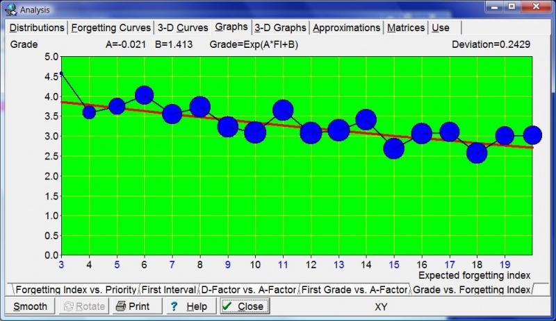
Grade vs. Forgetting Index - FI-G graph correlates the expected forgetting index with the grade scored at repetitions. You need to understand SuperMemo Algorithm SM-15 to understand this graph. You can imagine that the forgetting curve graph might use the average grade instead of the retention on its vertical axis. If you correlated this grade with the forgetting index, you would arrive at the FI-G graph. This graph is used to compute an estimated forgetting index that is in turn used to normalize grades (for delayed or advanced repetitions) and estimate the new value of item's A-Factor. The grade is computed using the formula: Grade=Exp(A*FI+B), where A and B are parameters of an exponential regression run over raw data collected during repetitions.
3-D Graphs
3-D graphs that visually represent RF, OF, and Cases matrices (see: Matrices below)
Approximations
20 power approximation curves that show the decline of R-Factors along columns of the RF matrix. You need to understand SuperMemo Algorithm SM-15 to understand these graphs. For each A-Factor, with increasing values of the repetition number, the value of R-Factor decreases (at least theoretically it should decrease). Power regression is used to illustrate the degree of this decline that is best reflected by the decay constant called here D-Factor. By choosing the A-Factor tab at the bottom of the graph, you can view a corresponding R-Factor approximation curve. The horizontal axis represents the repetition number category, while the vertical axis represents R-Factor. The value of D-Factor is shown at the top of the graph. The blue polyline shows R-Factors as derived from repetition data. The red curve shows the fixed-point power approximation of R-Factor. The green curve shows the fixed-point power approximation of R-Factor derived from the OF matrix; this is equivalent to substituting the D-Factor obtained by fixed-point power approximation of R-Factors for the D-Factor obtained from DF-AF linear regression. A fixed-point approach is used for both approximations since for the repetition number equal to two, R-Factor equals A-Factor.
Matrices
You need to understand SuperMemo Algorithm SM-15 to understand these tables.
- OF matrix - matrix of optimal factors indexed by the repetition number and A-Factor (except for the first repetition, A-Factor is replaced with memory lapses)
- RF matrix - matrix of retention factors
- Cases - matrix of repetition cases used to compute the corresponding entries of the RF matrix (double click an entry to view the relevant forgetting curve). This matrix can be edited manually (e.g. if you want to change the weight of some measurements during repetitions)
- Intervals - matrix of optimum intervals derived from the OF matrix
- D-Factors - vector of D-Factor values for different A-Factor values (also repetition cases used in computing particular D-Factors)
Use
Graphs of changes in the statistics of the learning process over time. These graphs record daily changes to statistics such as the number of memorized items, measured forgetting index or the number of outstanding items for a given day. The first non-zero value of the day is recorded. If that value increases afterwards, that increase is ignored (except a few cases such as the statistic of newly memorized items, etc.). If you have a break in learning, the last recorded non-zero value will propagate through the period in which you did not use SuperMemo (except a few cases such as the statistics of repetitions made, etc.).
To zoom in on a portion of the graph (as in pictures below), sweep the portions of the graphs that are to be removed with the mouse, i.e. point at the day of focus, move the mouse left and release the mouse button. This cuts away part of the graph in the direction that the mouse was moved. You can also use Ctrl+Left and Ctrl+Right buttons to zoom in (see below)
Use statistics
Here are the statistics recorded daily by SuperMemo and displayed on the Use tab:
- Work done
- Use time - your daily total time in which you actively used a given collection (as recorded in Tools : Sleep Chart)
- Recall time - your daily total time which you spent on trying to recall answers to questions
- Repetitions - your daily recorded number of item and topic reviews
- Item repetitions - your daily record of item repetitions
- Topic reviews - your daily record of topic reviews
- Outstanding - number of outstanding elements scheduled for a given day
- Outstanding - number of all outstanding elements scheduled for a given day
- Outstanding items - number of outstanding items scheduled for a given day
- Outstanding topics - number of outstanding topics scheduled for a given day
- Burden
- Burden - current Burden parameter record. Burden estimates the number of elements scheduled for repetition daily on the assumption of no delays in the learning process. Burden is the sum of interval reciprocals. Burden = Item burden + Topic burden
- Item burden - current Burden for items
- Topic burden - current Burden for topics
- Element count
- Elements - total number of elements in the collection as recorded on a given day (i.e. topics + concepts + items + tasks)
- Items - number of items in the collection as recorded on a given day
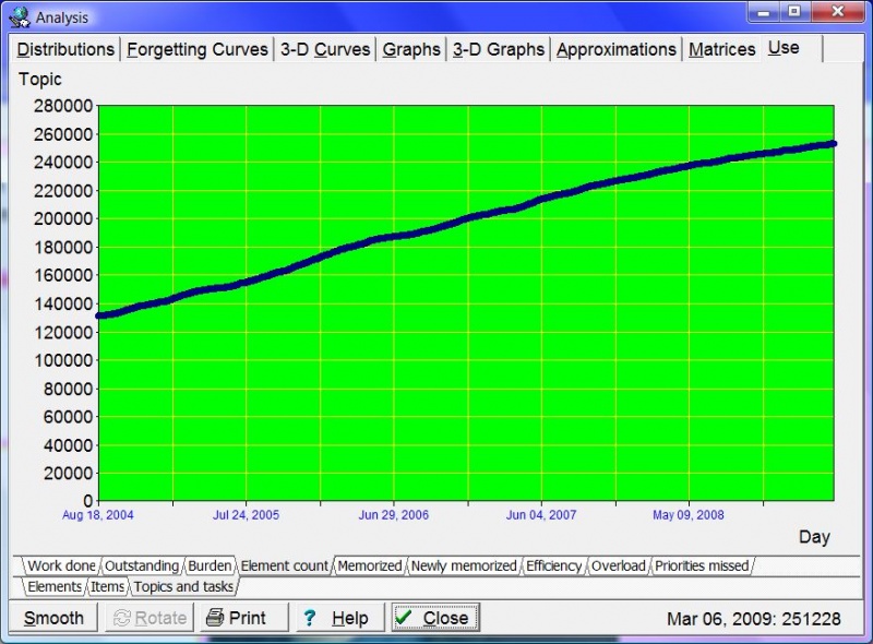
- Topics and tasks - number of topics and tasks in the collection as recorded on a given day (see exemplary graph below)
- Tasklist (name of the currently selected tasklist) - number of tasks on the currently used tasklist (its name is displayed in parenthesis). Use the Tasklist combo box in the Tools toolbar to change the currently selected tasklist.
- Memorized
- Newly memorized
- Newly memorized - new elements memorized on a given day (see exemplary graph below)
- New items - new items memorized on a given day
- New topics - new topics memorized on a given day
- Efficiency
- Forgetting index - measured forgetting index (data stored with a degree of smoothing to visualize trends)
- Retention - retention as measured on each day. This graph is smoothed for better readability of long term trends. For a more precise reading, see the next tab: Recall. The Retention tab can now hold over a decade of data and is retained for compatibility. Recall tab contains unprocessed raw data that you can always polish with Smooth to visualize trends
- Recall - proportion of correct answers on each day (as registered by Algorithm SM-17). This is raw unprocessed data that you can export to Excel for your own analysis. Compare with the Retention tab. It should also correspond roughly with data displayed on the Forgetting index tab (Recall is 100% minus the forgetting index)
- R in SM16 - retrievability (R) estimated by Algorithm SM-15 (R is the predicted value of retention, while Recall is the measured value of retention)
- R in SM17 - retrievability (R) estimated by Algorithm SM-17
- SM16/SM17 Diff - percentage point difference between recall estimation deviations by SuperMemo algorithms (abs(R16-Recall)-abs(R17-Recall)). The higher the difference, the better the performance of the new Algorithm SM-17. It is the ability of the algorithm to accurately predict the probability of forgetting that makes its strength in spaced repetition. This tab shows you how close SuperMemo 17 is to predicting the recall accurately (as compared with older algorithms)
- SM16 Metric - performance metric for Algorithm SM-15. It is a square root of the average of prediction differences squared expressed in percentage points (lower number means better recall prediction accuracy)
- SM17 Metric - performance metric for Algorithm SM-17. It is computed in the same way as the analogous parameter on SM16 Metric tab. Ideally, numbers on this tab should be lower though, indicating superiority of Algorithm SM-17
- SM16/SM17 Metric - the ultimate performance metric for Algorithm SM-17. It compares it with the old Algorithm SM-15. It is the performance metric difference between the two metrics from previous tabs: SM16 Metric minus SM17 Metric. The higher the number, the greater the superiority of Algorithm SM-17 for a given collection. On days with a negative metric, the old algorithm would perform better than Algorithm SM-17. As forgetting is random, the actual metric outcome for a day is a lottery. Only a larger number of repetitions per day provide for consistent outcomes. For an exemplary graph based on 8800 data points, see: example below.
- Topic load - proportion of topics scheduled for review on a given day among all elements scheduled. Topic load = Outstanding topics / outstanding elements. Topic load is expressed in percent for any given day. Topic load should not be confused with proportion of topics in sorting criteria. Proportion of topics is determined independent of the topic load if possible (e.g. for zero topic load, you cannot achieve proportion greater than zero, etc.). If you do not use auto-sorting, topic load tells you what proportion of your repetitions is made of topics.
- Overload - the number of executed repetitions divided by the number of outstanding repetitions (i.e. the percent of the actually executed repetitions)
- Elements - the percent of all outstanding repetitions executed
- Items - the percent of outstanding item repetitions executed
- Topics - the percent of outstanding topic reviews done
- Priority protection - your processing capacity for high priority material on a given day. If your graph oscillates around priority of 3%, you will know that only top 3% of your learning material is guaranteed a timely repetition. You can increase that number by doing more work, reducing inflow of new material, deprioritizing less important elements, or reducing the randomization degree for the outstanding queue sorting criteria. Read about this important parameter in Prioritization Rulebook
- Items - the highest priority item (with the lowest %) that was missed in repetitions. (The actual % in the outstanding queue can be much higher (because you mostly review high priorities))
- Topics - the highest priority topic (with the lowest %) that was missed in repetitions. (see: exemplary graph below)
- Next (Ctrl+Tab) - switch to the next major Use statistic tab
- Previous (Shift+Ctrl+Tab) - switch back to the previous major Use statistic tab
- First (Home) - switch to the first major Use statistic tab (Work done in SuperMemo 15)
- Cut off left (Ctrl+Right arrow) - cut off the left part of the graph to zoom in on the rest of it
- Cut off right (Ctrl+Left arrow) - cut off the right part of the graph to zoom in on the rest of it
- Cut off top (Ctrl+Down arrow) - cut off the top part of the graph to zoom in on the rest of it
- Close (Esc) - close the Analysis window
Examples
Use : Efficiency : R-Metric
Figure: R-Metric graph demonstrates superiority of Algorithm SM-17 over the old Algorithm SM-15 for the presented collection used in the testing period of 12 months before the release of SuperMemo 17. It was plotted using 10,699 data points (i.e. repetition cases with data from both algorithms), and smoothed up to show the trends. One spot beneath the line of 0 at the vertical axis (R-metric<0) corresponds with a moment in time when the previous version of the algorithm appeared superior (in this case, due to a small sample of repetitions). Some positive and negative trends correspond with changes in the algorithm as data were collected in the new algorithm's testing period. A gradual increase in the metric in the months Feb-May 2016, might be a statistical aberration, or it might be the result of new interval values and a bigger R-metric for intervals departing from the optimum used in earlier SuperMemos. The latter might indicate that the benefits of Algorithm SM-17 might gradually increase over time.Use : Element count : Topics and tasks
Figure: Exemplary graph showing the total number of topics stored in the collection. The data displayed at the bottom depends on the position of the mouse. In this example, it indicates that on Mar 6, 2009, there were 251,228 topics in the incremental reading process.
Use : Newly memorized
Figure: Exemplary graph showing the number of elements memorized on individual days. By sweeping away the left and right part of the graph, it is possible to zoom in on a small section of the learning process. The period shown on the graph spans from Jul 1, 2008 to Mar 19, 2009.
Use : Efficiency : Forgetting index
Figure: Exemplary graph enabling a more meaningful analysis of the forgetting index. Changes to forgetting index in Analysis use the daily measured forgetting index (previously: less informative cumulative measured forgetting index value was taken for the entire period since the last use of Tools : Statistics : Reset parameters : Forgetting index record). Note that the priority queue may distort the actual retention in your collection as measured values are primarily taken from top-priority material. Thus measured forgetting index should be understood as "forgetting index measured at repetitions", not as "overall measured forgetting index".
Use : Priority protection : Items
Figure: Exemplary graph showing the highest priority item (with the lowest priority %) that was missed in repetitions on a given day. In the picture, you can see the increase in the item priority protection from 0.5% to 11% within a month. This is possible by focusing on honest prioritization, doing lots of repetitions, avoiding mass up-prioritizations, etc.
Use : Priority protection : Topics
Figure: Exemplary graph showing the highest priority topic (with the lowest priority %) that was missed in reviews. The data displayed at the bottom depends on the position of the mouse. In this example, it indicates that on Jun 26, 2013, the worst miss amongst topics was a topic with priority equal to 7.613% of the queue of the most important topics to review.
